Reference: Rothy's, making a practical benefit the hero
A detailed look at rothys.com, a Shopify brand selling washable shoes and bags made with recycled materials, and how it handles a catalog with colour, size and width on every product. Not my client work.
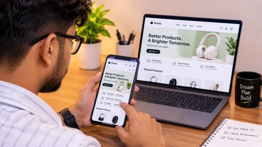
Reference study for previewing the case-study layout. This is not my client work. All facts come from what’s publicly visible on rothys.com and its public Shopify catalog data. Ideas and opinions are clearly marked as mine.
At a glance
| Brand | Rothy’s |
| Category | Shoes and bags for women, men and kids |
| Platform | Shopify |
| Catalog (public sample) | 250+ products across flats, loafers, sneakers, Mary Janes, clogs and bags |
| Price range observed | About $40–$375; typical items around $155 |
| Main product options | Colour, size and (for some styles) width |
| Apps spotted in the code | Yotpo (reviews & loyalty), Gladly (support), Swym (wishlist), Intelligems (price & offer testing), Constructor (search), Shop Pay |
The challenge for a store like this
Rothy’s sells premium-priced shoes in many styles, colours, sizes and widths, which means a lot of variants per product. The store needs to make one simple benefit stand out, help people find their exact style and fit, and justify the price.
Homepage walkthrough
- The benefit in the page title. “Washable Shoes and Bags Made with Recycled Materials”: practical and values-driven in one line.
- Style-first browsing. The store description lists clogs, Mary Janes, flats, sneakers and loafers: the words people actually search for.
- Audience coverage. Women, men and kids are all served from the same store.
Catalog and navigation
- Product types are named after models (The Point III, The Penny Loafer, The Almond Ballet, The Ivy Sneaker), so each style becomes a recognizable product line.
- 166 collections slice the catalog by style (“Clogs for All”), colour (“Black Shoes & Bags”, “Blue Flats”), occasion (“Bridal Flats”) and offer (for example gift-with-purchase on bags over a certain price).
- Dedicated search (Constructor) helps shoppers navigate a large, variant-heavy catalog.
Products and merchandising
- Every product offers colour; most offer size; some add width, which helps a lot with fit and returns.
- Material names (like ReVelvet™) become selling points in product titles.
- Kids’ versions of popular styles extend best sellers to new customers.
Trust and conversion
- Reviews (Yotpo) back up comfort and durability claims.
- A wishlist (Swym) suits a considered, higher-priced purchase.
- Intelligems points to a store that actively tests prices and offers, instead of guessing.
- Shop Pay speeds up checkout.
Ideas I’d test
These are my own suggestions, not facts about the store:
- A short visual “how washing works” block on product pages.
- A width guide right next to the size selector.
- Durability messaging (how long the shoes last) near the price, to justify it.
What this teaches for your own case studies
- When a product has one clear advantage, show how the store puts it front and center.
- Explain how you handled complex variants (colour × size × width) without confusing shoppers.
- Mention testing and data (A/B tests, search), because it shows decisions were measured, not guessed.
Want a store this well thought out?
Tell me about your store and what you want to improve. The first meeting is free.